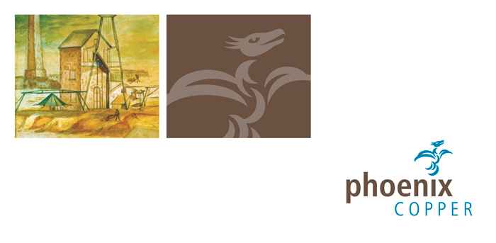
Our approach, combines the company’s name with the mythological phoenix rising from the letterforms. There’s also scope to alter the second part of its name should the company happen to divert its attention or change its focus in the future.
As part of our overall strategy, we then incorporated visual messages that reflected the history (as the aim of the company is to rejuvenate some of Australia’s historically significant mining regions). Also the use of a sepia colour tone reinforces the message. This combined with the logo gave us the visual tools to keep the corporate message uniform as we applied it to other various communication requirements. All sharing the same branding attributes to create a memorable and distinctive presence.
Brand success: The Initital Public Offering was successful and PNX listed on the ASX early 2008. This is a significant listing as it was acheived during a period of an investment caution for all stocks. Confidence in the brand is an on-going perception, however, we are able to play our part by producing cost-effective solutions by adapting these initital visual elements to keep the brand message consistent and focussed. We also believe that this makes the organisation attractive to employees and aids in the retention of staff.