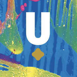
 The objective from the outset was to reinforce that UraniumSA was not being established on the same basis as other small exploration companies. It was going to be a company with lateral approaches and different structures and skills. This meant avoiding cliché images...
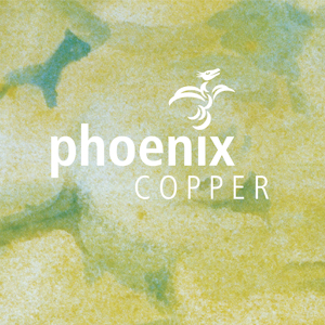 Our approach, combines the company’s name with the mythological phoenix rising from the letterforms. There’s also scope to alter the second part of its name should the company happen to divert its attention or change its focus in the future. As part of our overall...
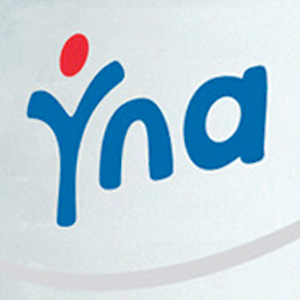 A logo identity where the ‘Y’ represents the individual – You, and if you look closely you might see the patient at rest. Overall, this abstract impression is a humanist approach which parallels the nature of the business. The logo has been applied to a range of...
 Our work for Trinity Gardens School has complemented the professional outlook of this growing, inner-eastern suburbs school. We were commissioned to develop a series of pull-up displays, in collaboration with the school, to highlight the school’s values. Our work...
 Utter Gutters These symbols were created as date-base icons for the ipad display. They needed to be functional and understandable so that any of the client’s staff could use it to navigate through, and at the same time present well to the customer who may be...