 A mineral exploration company based in South Australia. Our approach was to develop a typographic solution based on the action of an arrow flying through the letterforms to hit its target. Accuracy and precision became the logo message. Visual language:
As part of...
 The symbol is suggestive of environmental containment and management. Further branding meant developing a range of illustrations indicative of the science associated with the company’s pest control...
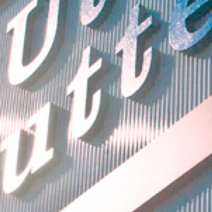
 Name development and branding for a guttering and roofing company. The design aims to use its strong memorable name as a cue should there be a need. Brand success: Since we conceived the idea in 2001. Utter Gutters has grown to become one of the most recognised brands...
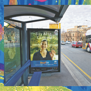
 ‘When fingers do the talking’. The brand was applied to a range of stationery, displays and promotional material, including a bus shelter ad.
 The objective from the outset was to reinforce that UraniumSA was not being established on the same basis as other small exploration companies. It was going to be a company with lateral approaches and different structures and skills. This meant avoiding cliché images...


