
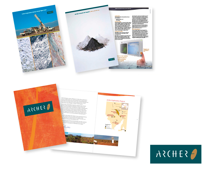
A mineral exploration company based in South Australia. Our approach was to develop a typographic solution based on the action of an arrow flying through the letterforms to hit its target. Accuracy and precision became the logo message.
Visual language: As part of our overall strategy, we then incorporated visual messages that reflected the geological pattern and colours of the Australian outback. This combined with the logo gave us the visual tools to keep the corporate message uniform as we applied it to other various communication requirements. All sharing the same branding attributes to create a memorable and distinctive presence.
Brand success : The Initital Public Offering (IPO) was made in mid 2006. This was successful and heavily oversubscribed. Confidence in the brand is an on-going perception, however, we are able to play our part by producing cost-effective solutions by adapting these initital visual elements to keep the brand message consistent and focussed. We also believe that this makes the organisation attractive to employees and aids in the retention of staff.