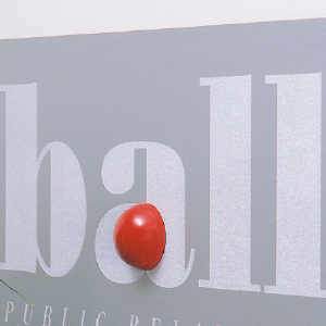
 A public relations firm with a strong, dynamic name. A typeface was selected, and modified, to draw attention to the memorable red dot within the type – representing the definitive statement and the key core message. It was also important to incorporate the full...
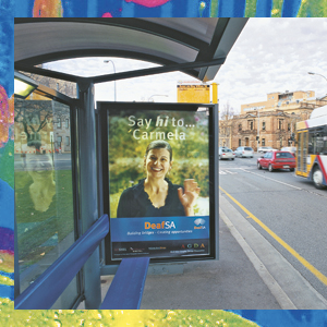
 ‘When fingers do the talking’. The brand was applied to a range of stationery, displays and promotional material, including a bus shelter ad.
 Our clients benefit from over twenty years of design experience. We’ve worked with a broad range of sole-traders and large international corporations – building logos, symbols and brands to create a complete visual language that differentiates and...
 Finding creative visual solutions for our clients is the cornerstone of our business. We were recently commissioned to develop an ‘object’ representing the Department for Families and Communities’ commitment to reconciliation. The ‘object’ was then to be included with...
 The objective from the outset was to reinforce that UraniumSA was not being established on the same basis as other small exploration companies. It was going to be a company with lateral approaches and different structures and skills. This meant avoiding cliché images...
