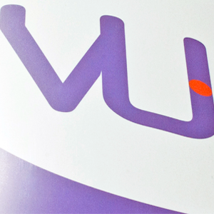
A newly formed Adelaide-based medical practice was in need of an identity to establish itself within the marketplace. Due to the relatively long trading name, our approach was to create a symbol of its acronym and place emphasises on their core business (VU). We then put a bit of life into them to get the ‘blood flowing’ and kick start their venture! Hence the movement associated with the letter P.

